Last Updated on 3rd September 2018 by Ian Richardson
First Impressions – Fashions change and so do door colours
A long time ago in blog writing terms – back in 2014 to be precise here at GFD Group we regularly received one much repeated question on our FAQ pages –
“What is the difference between Georgian, Regency, Edwardian and Victorian doors – different manufacturers seem to classify the same style of door to different periods”?
At GFD we always try to clarify our customers needs, so we went back to the books checked out what we thought we knew to ensure our facts were correct and published a series of articles (which were well received at the time) on our sister “Global Door “web site (Global rather than Timber Composite because Global actually used the regal terms to describe their doors) the articles were entitled “The Doors of the Monarchs – an introduction” ––“ Georgian Doors- What are Georgian Doors” – “Regency Composite Doors – what specific criteria defines a Regency Door”– “Victorian Doors by Global Composite Doors” –“Edwardian Doors by Global Composite Doors”
In addition to a review of the styles of the period and what defined them we also highlighted the preferred colour of choice for the front door of each period – to quote –
“Georgian – Their choice of colours was very different from that which we are used to today, mainly due to pigment technology rather than taste. Iron and red oxides were by far the cheapest pigments in those days, so the colours they used were very often rather dull by today’s standards, with various shades of brown and murky greens being used in the majority of instances.
Regency – As with the Georgian era the choice of colours for painting doors was still limited and the preferred colours were painted black or bronze-green
Victorian -The use of carved and panelled doors was still the norm at the start of the Victorian era with dark green being the preferred door colour.
Edwardian would have been painted in a range of colours with the carved door panels and frames were often decorated in contrasting shades.”
A pretty miserable choice by todays standards but that is to be expected with almost two hundred years of painting and coating technology having passed since these historic times.
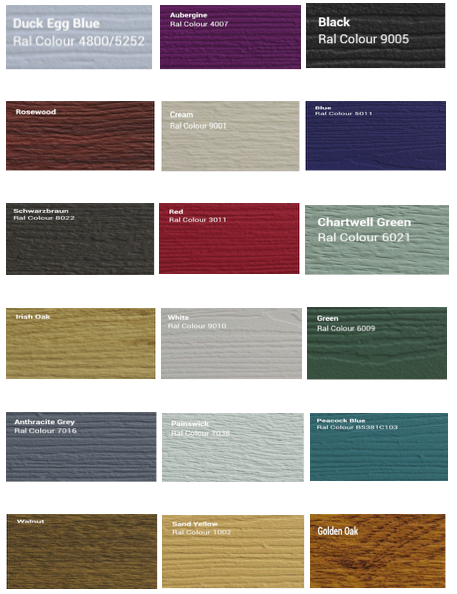
The Timber Composite Doors range of twenty colours as it was until a short time ago would most certainly have impressed our ancestors from the Georgian, Regency, Edwardian and Victorian periods but as we now live in a more colourful and vibrant world, so much more is required from our choice of front door colours.

Each year someone sets a trend and attempts to predict/define the choice the public will make in its selection of preferred colours this year the majority of newsprint credits George Clarke as this years pundit of choice.
George Clarke architect and the current TV guru in all design and style matters was asked to by a well-known periodical to name his 10 most popular colours for the current year 2018 and no doubt his choice was influenced by this year’s Pantone colour of the year which is Ultra Violet
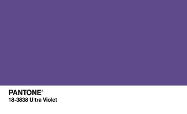
-because the colours he chose were – Mid purple, Steel blue, Light violet, Black, Crisp white., Bright yellow, Grey and Cobalt blue.
Our standard twenty colours featured above already include examples either the same or close to George Clarke’s list but that s not good enough for our clients so the three new colours – Pastel shades – as shown at the head of this article have been added to our range and are now available on all of our doors.
Fresh and floral Lavender
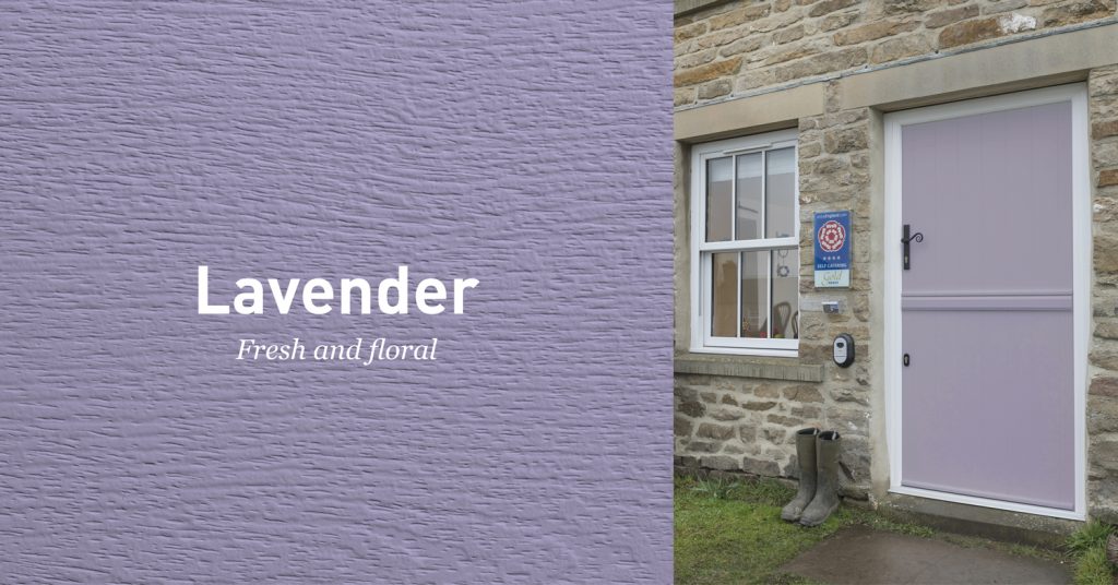
Subtle and elegant a colour which look great on both traditional and contemporary doors – add a few ornate planters and the entry to your home will look spectacular.
Strong and Vibrant – Cobalt Blue
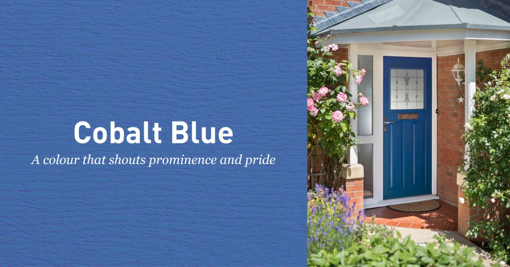
Blue is supposedly the colour of serenity and safety and this shade possesses the strength to make you believe that claim might just be correct particularly when surrounded by a shining white frame which adds more strength and prominence to the depth of the colour.
Tranquil and restful – Twilight grey
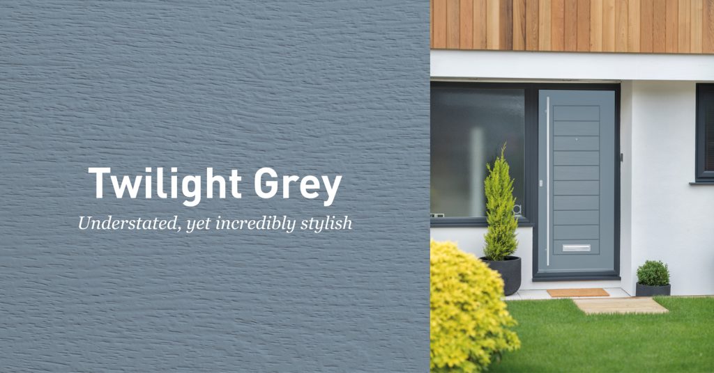
Restful is the word to describe this colour a colour that oozes class and style when used on a contemporary door such as that shown- a colour that also lends itself to contrasts try a darker shade of frame colour to highlight this most delicate of shades.
If you think the colour and style of your front door does not matter take note of these much reproduced quotations from a 2007 article on “First impressions” referring to front doors of homes
“The colour, material and style of a front door can make or break a house sale. Get it wrong, and it could be all over in seconds…”
“People look at a front door before they look at anything else. Your front door reflects what you think about the house. A door can sell a property.”
At Timber Composite Door and Composite Door Prices (both members of the GFD Group of companies) we can show you the very best of our Solidor Composite Door range – quality doors at competitive prices – now with three new Pastel shade colours. They are all there on our web sites.
PS if you want to get a head of the game and see what colours Pantone are predicting for 2019 take a look at “Pantone Colour trends for 2019” – unfortunately we cannot yet guarantee to provide a new door colour to match whatever they decide.